Understanding Templates in AEM: Static vs Editable
Templates in Adobe Experience Manager (AEM) control the structure, policies, and component availability for pages. Broadly, AEM supports two kinds of templates:
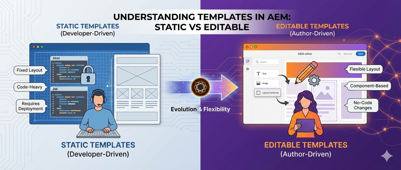
- Static Templates (classic, code-managed)
- Editable Templates (dynamic, UI-managed via Template Editor)
This guide covers both, along with how to create, configure, and use them, and lists all relevant properties you’ll encounter, including Allowed Paths, Children, Parent, Policies, Layout Container options, and more.
1) Static Templates
Static templates are repository nodes under /apps (or /libs) that define a fixed page structure using JSP/HTL includes. They are owned by developers, and changes require code deployment.
- Fixed layout; no dynamic connection to created pages.
- Managed via code in
/apps/<project>/.... - Typically use
cq:Template,cq:Page, and component includes. - No Template Editor or policies support (unless emulated via design configs).
Typical Structure
/apps/<project>/
  ├─ components/
  │   └─ page/
  │       ├─ page.html                     (HTL)
  │       └─ ...
  ├─ templates/
  │   ├─ content-page/                     (cq:Template)
  │   │   ├─ jcr:content (cq:PageContent)
  │   │   │   ├─ root (wcm/foundation/components/parsys)
  │   │   │   └─ ...
  │   └─ ...
  └─ ...
When to Use
- Highly rigid websites with rare layout changes.
- Environments where template changes must be controlled via deployment and code reviews.
Creation
- Under /apps//templates, create a node (e.g., content-page) of type cq:Template.
- Define jcr:content with a root container (e.g., parsys).
- Point page component to your template using sling:resourceType.
- Create pages using this template via Page creation wizard.
2) Editable Templates
Editable templates are created and managed in AEM’s Template Editor. Pages created from them retain a dynamic connection to the template — so updates to the template propagate to the pages (except for initial content areas where authors add/override content).
Editable: Provide templates that retain a dynamic connection to any pages created from them. This ensures that any changes to the template are reflected in the pages themselves.
Who Works on Them?
- Template Types: created/edited by developers (you can copy an existing type and reference a page component).
- Templates: created/edited by template-authors group in the Template Editor.
Default Editable Template Types
When you click Tools → Templates, AEM usually offers default types like:
- Core Component Page
- HTML5 Page
- Adaptive Form Page
Developers can add custom template types by copying an existing template type and pointing to a custom page component.
3) Creating Editable Templates — Step-by-Step
Step A — Create a Configuration Folder
Path: Tools → General → Configuration Browser
- Click Create and make /conf/.
- Ensure standard structure:
/conf/<project>/
  ├─ settings/
  │   └─ wcm/
  │       ├─ templates/       (editable templates live here)
  │       └─ policies/        (component policies live here)
  └─ ...
The settings/wcm/templates folder holds your template definitions & settings/wcm/policies folder holds policies for components used in templates/pages.
Step B — Create Templates
Path: Tools → Templates
- Select your /conf/.
- Click Create → choose base type:
- Core Component Page
- HTML5 Page
- Adaptive Form Page
- Name the template (e.g., “Article Page”).
- Set properties like Allowed Paths and Allowed Templates (more on these below).
Step C — Define Template Structure (Template Editor)
Inside the Template Editor:
- Add a Structure (Locked) layer:
- Place Layout Container (responsive grid).
- Add headers, footers, sidebars as locked components (authors cannot remove them).
- Add Initial Content layer:
- Define default content for authors to start with (e.g., hero component, placeholder text).
Step D — Configure Policies
Policy controls which components can be used in a given container and their styling options.
Example policy usage:
- Restrict a layout container to only allow Text, Image, Title, Lists.
- Configure styles, max items, responsive behaviour, allowed nesting.
4) Properties & Options (Editable Templates)
Below are the commonly used properties you’ll configure in Templates and Policies:
Template Properties (at /conf//settings/wcm/templates/
- Title / Name: Display name and node name.
- Description: Optional metadata for authors.
- Enabled: Whether authors can use this template.
- Allowed Paths: Where this template can be used to create pages.
- Example: /content/my-site(/.*)?
- Allowed Templates: Which templates can be used under a specific path or subtree (used in content trees to restrict available templates).
- Allowed Parent: Which parent templates (if your site supports nested template inheritance).
- Allowed Children: Which templates can be used as sub-templates in specific scenarios.
- Thumbnail / Preview Image: Display in the Create Page dialog.
- Advanced
- sling:resourceType: Page component type the template renders with (e.g., my-site/components/page/default).
- cq:templateType: Reference to template type (e.g., core/wcm/components/page/v3/templateType).
- initialContent (optional): Default content nodes created on page creation.
Layout Container (Responsive Grid) Options
- Use as Column Container: Enables columns inside the container.
- Number of Columns / Breakpoint behavior: Define how items rearrange in mobile/tablet/desktop.
- Allowed Components: Set via Policy.
- Styles: Author-selectable styles (e.g., “Full-width”, “Narrow”, “Padded”).
- Grid Settings
- Column width units (e.g., 12-column grid).
- Responsive behavior: hide/show per breakpoint, column spans, ordering.
- Nested Containers: Allow inner layout containers for complex structures.
Policy Properties (at /conf//settings/wcm/policies/…)
Policies define rules and defaults for a component in a specific context (e.g., Text component inside the main container).
- Target Component: e.g., core/wcm/components/image/v3
- Allowed Components: List or groups of components permitted in a container.
- Groups: Logical grouping (e.g., “Content”, “Media”, “Commerce”).
- Default Configuration
- Text: Allowed formatting, max length.
- Image: Allowed renditions, lazy-load, aspect ratios.
- Teaser: Heading levels, CTA styles.
- Styles: Controlled style system entries (CSS classes bound to labels).
- Responsive Behavior: Per-breakpoint options for display/hide.
- Client Libraries / Category: Optional; bind authoring experience CSS/JS.
Policy binding: Policies are bound to containers or components in the Structure layer of the template.
5) Static vs Editable — Summary Comparison
| Aspect | Static Templates | Editable Templates |
|---|---|---|
| Management | Code (developers) | UI (template authors + policies) |
| Dynamic connection | ❌ None | ✅ Changes propagate to created pages |
| Policies & Style System | Limited/none | ✅ Fully supported |
| Initial Content | Typically manual/default includes | ✅ Supported via Template Editor |
| Deployment | Required for changes | Not needed for content/policy/layout changes |
| Best for | Rigid, legacy setups | Modern, flexible, author-friendly sites |
6) Advanced Tips & Best Practices
- Template Types: Create custom template types for specific page components (copy an existing type and update sling:resourceType to your page component).
- Governance: Use Allowed Paths and cq:allowedTemplates to enforce where templates can be used.
- Policies: Keep policies centralized under /conf//settings/wcm/policies and name them meaningfully for reuse.
- Layout Containers: Prefer reusable Structure layer layouts and keep author freedom in Initial Content.
- Versioning: When changing templates that affect many pages, consider content freeze, preview, and rollback plans.
- Performance: Avoid over-nesting Layout Containers; use component-level styles rather than heavy markup duplication.
7) Common Properties Reference (Quick List)
- Template (cq:Template / Page Content)
- title, description, enabled
- sling:resourceType, cq:templateType
- allowedPaths (array)
- cq:allowedTemplates (usually at content root)
- thumbnailPath
- initialContent (node subtree)
- Policy
- allowedComponents (array of resourceTypes)
- groups (array of labels)
- styles (name/label pairs)
- responsive (breakpoint configs)
- Component-specific defaults (e.g., image renditions, text formatting)
- Layout Container
- Column count, breakpoints
- Nesting allowed
- Style system entries
- Component drop restrictions via policy


Post Comment